When a neighbor’s eight-year-old daughter innocently asked why her Christmas tree looked “so messy,” it stopped one decorator off her tracks, she might lose her moral if not careful. That simple, honest question revealed what polite adults never said out loud, her tree decoration was enticing, it was chaotic.
That moment became a turning point. Determined to understand what makes some Christmas trees look effortlessly elegant while others fall flat, she began studying decorating techniques, experimenting with lighting, ornament placement, and design balance.
Over the years, i discovered that beautiful trees aren’t about having more decorations, they’re about using what you have with strategy, restraint, and a clear sense of design.
What fascinates me most is how predictable tree decorating failures are. The same problems show up whether someone spent twenty dollars at a discount store or two hundred at a boutique shop. I’ve watched people work on their trees for entire afternoons, getting increasingly frustrated as each addition somehow makes things worse instead of better. I’ve also seen trees come together beautifully in under an hour because the person understood a handful of key principles.
Christmas trees seem straightforward on the surface, stick it in a stand, plug in some lights, hang your ornaments, call it done. But there’s actually a strategic approach that separates trees that photograph well from trees that make you cringe when you look back at holiday pictures. Most of us never learn this approach because tree decorating isn’t something anyone formally teaches. We wing it based on childhood memories and hope for the best, perpetuating techniques that never actually worked.
Why Some Trees Looks Perfect and Others Don’t
Mixing too many decorating styles, like farmhouse, glam, vintage, and minimalist, doesn’t make your space look creative, it just makes it feel messy.
Each style has its own “vibe,” and when you blend too many at once, the room ends up feeling confusing instead of cool. Stick to one main style and add small touches from another to keep things looking balanced and intentional.
Christmas Tree Decorating Disasters you might be making.
1. Starting with Ornaments Instead of Lights

This is the most common disaster, and it’s one I made for years. You get excited, start hanging your favorite ornaments, and then try to weave lights around them afterward. The result is uneven lighting, visible cords, awkward dark spots, and frustration as you try to reach between ornaments without knocking them off.
Lights are your foundation, they need to go on first, while you have full access to all branches. Professional decorators use a specific lighting technique: instead of wrapping lights around the outside of the tree in a spiral (which most people do), they weave them in and out, pushing some strands deep into the tree’s interior and keeping others on the outside. This creates depth and makes the tree glow from within rather than just having a lit surface.
Here’s the process that actually works: start at the top, plug in your lights before putting them on the tree (so you know they work), and weave them through branches in a vertical pattern rather than a horizontal spiral. Push every third or fourth strand deep into the tree, close to the trunk. This takes more time than the spiral method, but the difference in the final effect is dramatic. Your tree will have dimension and depth instead of looking like a lit cone.
I resisted this method for years because the spiral seemed faster and easier. The first time I actually tried the weaving technique, I was shocked at how much better my tree looked with the exact same lights I’d always used. The lights created depth and the tree looked professionally done. Now I won’t decorate any other way, even though it adds twenty minutes to my setup time.
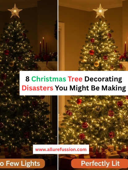
2. Using Nowhere Near Enough Lights
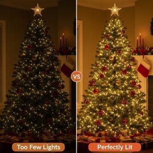
Most people drastically under-light their trees. That single strand of 100 lights on your six-foot tree? It’s not enough, not even close. The rule professionals use is 100 lights per foot of tree height as a minimum, with 150 per foot being ideal for a really stunning glow.
A six-foot tree needs 600-900 lights. A seven-footer needs 700-1,050. That seems excessive until you see it in person. A properly lit tree has presence and impact. An under-lit tree looks sad and dark, and all your beautiful ornaments disappear in the shadows. I used to think three or four strands of lights was plenty. Then I tried using the recommended amount and immediately understood why my trees had always looked dim and underwhelming.
The type of lights matters too. LED lights last longer and use less electricity, but some people prefer the warmer glow of incandescent bulbs. Whichever you choose, stick with one type and one color temperature throughout the entire tree. Mixing warm white with cool white, or LED with incandescent, creates an unintentional patchwork effect that looks like a mistake rather than a choice.
If you’re thinking, “But that many lights costs a fortune,” here’s the reality: you can buy lights on deep discount after Christmas for next year, and quality lights last for years. This is an investment that pays off every single holiday season. Plus, adequate lighting makes even mediocre ornaments look better, while inadequate lighting makes expensive ornaments disappear.
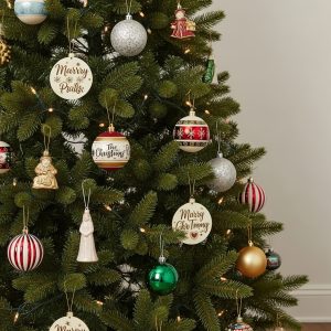
3. Hanging Every Ornament on the Branch Tips
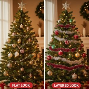
Walk up to most people’s trees and you’ll notice all the ornaments hang at the same depth, on the outer tips of branches. This creates a flat, one-dimensional look that screams amateur. The tree becomes a decorated surface rather than a decorated volume.
Professional decorators place ornaments at three different depths: some on the branch tips (visible layer), some midway back on branches (middle layer), and some tucked deep inside near the trunk (hidden layer that creates mystery and depth). This layering technique is what creates that lush, full appearance you see in magazine photos and hotel lobbies.
The ornaments you place deep inside don’t need to be your showstoppers, in fact, they often won’t be fully visible. That’s the point. They catch light, create shadow and depth, and make the tree look fuller and more complex. I use my less exciting ornaments for this deep layer, plain balls in coordinating colors that add volume without needing to be featured pieces.
This was a game-changing technique for me. I’d always wondered why my tree looked thin and sparse compared to professional photos, even though I had plenty of ornaments. The answer was that everything sat at the same depth, creating no dimension. Now I consciously place ornaments at varying depths as I decorate, and my tree looks exponentially fuller with the same number of ornaments.
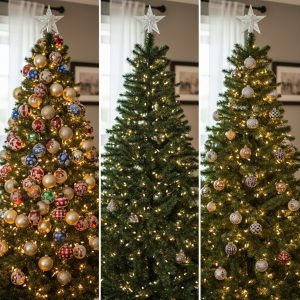
4. Ignoring the Size Distribution of Your Ornaments
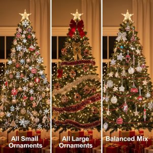
A tree covered entirely in small ornaments looks busy and chaotic. One with only large ornaments looks heavy and unbalanced. The magic happens when you use a thoughtful mix of sizes that creates visual hierarchy and interest.
The professional ratio is roughly 30% large statement ornaments, 40% medium everyday ornaments, and 30% small accent pieces. Large ornaments anchor your design and fill space efficiently. Medium ornaments are your workhorses that create consistency. Small ornaments add sparkle and detail without overwhelming.
I used to buy ornaments randomly based on what I liked, which meant I accumulated mostly medium-sized pieces because they’re usually the cheapest. My trees lacked drama because nothing was substantial enough to create impact, but they also lacked delicate detail because I had few small pieces. Once I started shopping intentionally by size category, specifically seeking out large statement pieces and tiny accent ornaments, my trees improved immediately.
Place your large ornaments first, distributing them evenly around the tree to create balance. Then fill in with medium ornaments, and finally add small pieces in clusters near larger ones to create visual interest. This sequence prevents you from running out of room for your big pieces because you’ve already covered the tree with small ones.
5. Creating a Rainbow Instead of a Color Story
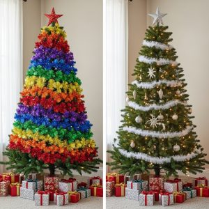
Red and green and gold and silver and blue and purple and pink, if it comes in a Christmas version, why not use it? Because the result looks like a kindergarten craft project rather than an intentional design. Your eye doesn’t know where to focus, and instead of feeling festive, the tree feels chaotic.
Professional trees use a limited color palette, typically two to three colors plus one metallic accent. Classic combinations work beautifully: red and gold, silver and white, blue and bronze, burgundy and cream. Even non-traditional palettes look sophisticated if they’re limited: all white, all silver, pink and gold, navy and copper.
This was my biggest personal tree mistake. For years, I used every ornament I owned, creating a multi-colored chaos that I thought looked “eclectic” but actually just looked messy. The year I committed to a specific color story, blue, silver, and white, was the year people started complimenting my tree instead of politely ignoring it.
You don’t need to throw away ornaments that don’t fit your chosen palette. Rotate color stories year to year, store the off-palette ornaments, or use them on a second tree in a bedroom or den. Your main tree in your primary living space should have color discipline. This single change will elevate your tree’s appearance more than almost anything else you can do.
6. Forgetting That Your Tree Needs a Proper Topper
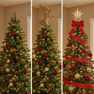
So many trees have either no topper at all, a topper that’s too small and gets lost, or one that’s too large and looks like it’s crushing the tree. The topper is your tree’s crown, it should feel like a natural extension and completion of the design, not an afterthought or an overwhelming addition.
Scale matters enormously with tree toppers. A topper should be proportional to your tree’s size and the visual weight of your decorations. A heavily decorated tree with large ornaments can handle a substantial topper. A minimally decorated tree with delicate ornaments needs a lighter, more delicate topper. A seven-foot tree with a four-inch topper looks unfinished. A six-foot tree with a two-foot topper looks top-heavy.
I went without a topper for years because I couldn’t find one I liked, and every photo of my tree shows this sad, unfinished point at the top. It’s like wearing a great outfit with no shoes, something essential is missing. Finally, I made my own using wire, ribbon, and some greenery from my garland, scaled specifically to my tree’s size. The difference was remarkable. The tree finally looked complete.
If your current topper isn’t working, don’t force it. Options beyond traditional stars and angels include large ribbon bows, clusters of picks and greenery, oversized ornaments, or even unique found objects that fit your style. The topper should tie together your color scheme and complement your ornament style. It’s the final punctuation mark on your tree’s design statement.
7. Neglecting the Bottom Third of Your Tree
People focus their best ornaments and most attention at eye level and above, then phone in the bottom section with whatever’s left. The result is a tree that looks great from the middle up and bare or messy below. Your tree should be beautiful from top to bottom, especially since the bottom third is actually the most visible section when you’re sitting down.
The bottom of your tree needs larger, more substantial ornaments because of perspective, small ornaments at the bottom disappear visually from normal viewing distances. This is also a great place for special ornaments with personal meaning, since they’re at a height where people can actually see details and read any writing.
I used to treat my tree’s bottom section as dead space, barely decorating it and certainly not using my nice ornaments there. Then I realized that when I actually sit in my living room (where I spend most of my time), I’m looking at the bottom half of the tree more than the top. Now I give the bottom section the same attention and quality ornaments as the rest, and my tree looks good from every angle and viewing position.
Don’t forget about the back of your tree either, especially if it’s visible from multiple angles in your room. Many people only decorate the front-facing side, which looks fine from one direction but terrible from others. Walk around your tree as you decorate and ensure every angle looks intentional.
8. Adding Decorations Without Any Spacing Strategy
Random ornament placement creates random visual disarray. Ornaments clustered too tightly compete with each other. Ornaments spaced too far apart look scattered and unconnected. Professional tree decorators use intentional spacing that creates rhythm and flow.
The technique is called triangulation: as you place ornaments, mentally draw triangles between them. Each ornament should form the point of multiple triangles with other ornaments. This creates a natural flow that guides the eye around the tree in a pleasing pattern rather than jumping randomly from one decoration to another.
Additionally, cluster smaller ornaments in groups of two or three near larger statement pieces. This creates visual interest and makes small ornaments more impactful, three small silver balls grouped together near a large blue ornament create a cohesive vignette. Those same three balls scattered randomly across the tree disappear.
I never thought about spacing strategy until I watched a professional decorator work. She would place an ornament, step back, assess, adjust slightly, then move to a different area of the tree for the next ornament. She wasn’t just hanging things randomly, she was building a composition. When I started being more intentional about spacing rather than just hanging ornaments wherever there was room, my trees suddenly had that polished, pulled-together look I’d been chasing for years.